
The brand's language balances elegance and extravagance with its wide range of products, starting from entry-level to high-end luxury. groupDCA used the façade design, spatial layouts, architectural elements, materiality, colour palette, and lighting schemes, to reflect a modern luxury imbued with warmth. The standout elements here are the unusual materials chosen, both in terms of colour and texture.
The extensive use of materials in the colour of exposed concrete demarcates entryways, distinguishing sections for watch brands. Here, the play with the neutral colour of concrete allows Ethos to connect brands of equal renown while stitching together its own identity as a boutique.
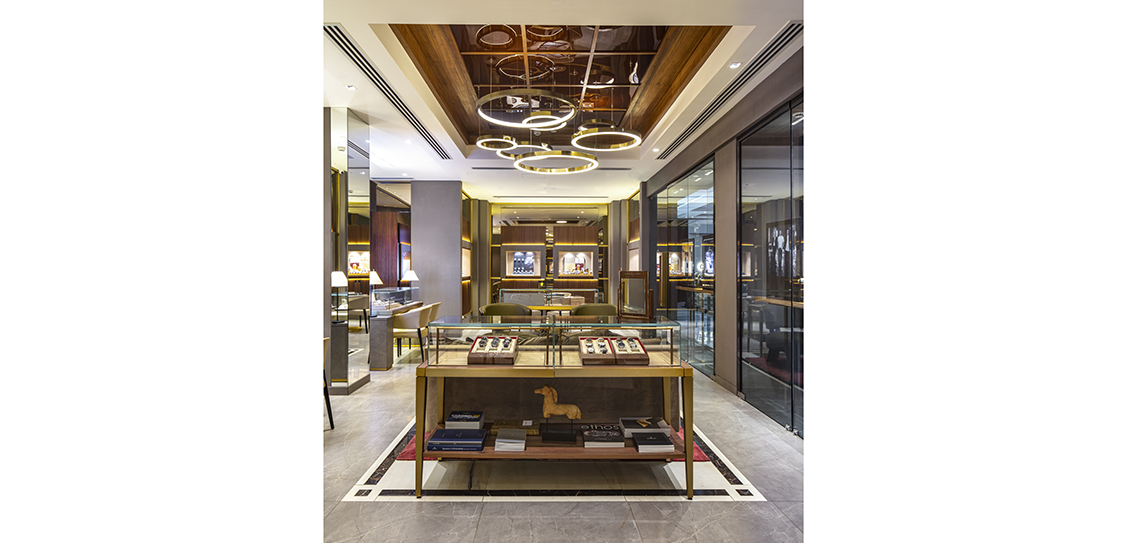
Wood panels are serrated with flutes, providing a subtle texture to the otherwise plain veneers. To add an opulent accent, a touch of champagne gold metal is used to accentuate tones of grey and wood. This combination is used on trims and profiles, especially on the abstract and artistic lattices on the lower facia of all the watch counters.
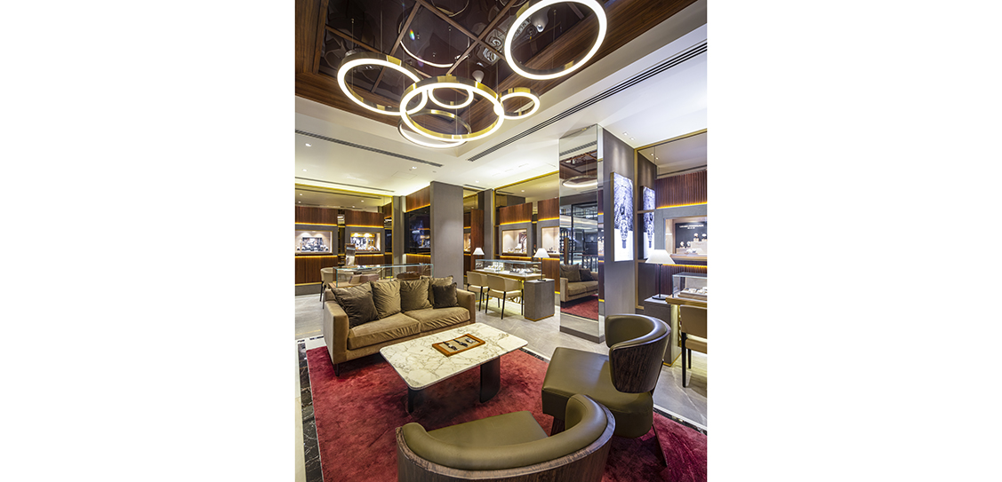
The stores blend materials and elemental furniture for an aesthetic balance. The flagships are also adorned with boutique lighting highlighting in-store displays. To enhance its impact, the common areas of the store are relatively dim. Bespoke chandeliers over the central seating are ring shaped to resemble watch dials floating in space, underlining Ethos’ brand identity further.
The luxury flagships are also fitted with a coffee-bar and a library to take advantage of the showrooms’ substantial space and offer customers warm, hospitable breaks in their shopping experience.