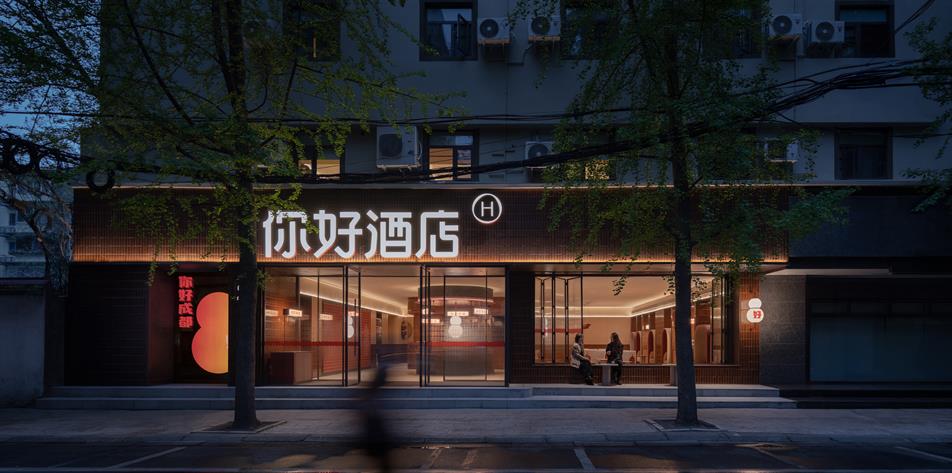
Project: NI HAO HOTEL
Award: Silver, Hospitality Interiors - Hotel & Other Overnight Accommodation, 2024
Location: Chengdu, China
Design Practice: Vermilion Zhou Design Group
Client: H World Group
Vermilion Zhou Design Group’s friendly and inclusive design for NI HAO hotel, is inspired by the standard Chinese greeting “NI HAO” which carries meaning beyond everyday salutations. It embodies the spirit of friendliness, politeness, and openness integral to Chinese culture. The judges described this as a "daring" and "courageous" idea. The practice’s design is intended to express a similarly traditional, vibrant and open atmosphere for this hotel, nestled within Chengdu’s bustling street market.
The doors are warmly opened to guests and the local community, inviting everyone to experience its welcoming atmosphere. With abundant slogans in the space, the very Chinese style of expression engages all guests, subverting traditional reception and lobby areas while serving functional purposes and aiming to resonate emotionally with travellers. From public areas to guest rooms, efficient layouts meet travellers' varied needs. Unintentional interactions in these spaces transform a simple "NI HAO" into a warm and intimate greeting.
“When developing the Ni Hao Hotel brand, we aimed to highlight its unique features and ensure guest comfort even with limited services. By using a friendly and pleasant design, we reinterpreted the Ni Hao Hotel, enhancing its brand identity and providing a better lodging experience for customers,” Vermilion Zhou Design Group said.
The judges said: "The translation of the Ni Hao concept into the physical space is executed with remarkable skill. Despite the hotel's low budget, the use of materials is expertly mastered, and the details and interior elements are well-balanced and integrated. The spaces are playful and intense, offering a fresh and novel experience that is both unusual and intriguing for this typology."
Design highlights
'Calabash', a traditional Chinese symbol, is incorporated throughout the space design. This symbol signifies blessings, fortune and safety for travellers. The simplified calabash imagery of '8' is continued throughout the space in various forms. It also symbolizes 'prosperity', embodying both a distinctly Chinese symbol and the representation of '∞'infinite possibilities.
"The project reflects the lifestyle of contemporary travelers, who are accustomed to technology, while also introducing unique, custom features that are more analogue, such as the tactile wall that engages children. The most innovative aspect lies not in the technology but in the ability to translate user needs and integrate the neighbourhood and local culture with a fresh, young hotel brand," the judges said.
Photo credit: Jian Quan Wu
CREATIVE DIRECTOR: Kuang Ming(Ray) Chou
CONCEPT DESIGN: Ting Ho. Brand
POSITIONING: Vermilion Zhou Design Group
INTERIOR DESIGN: Garvin Hung, Yue Hu, Yuxuan Li, Mingrui Gao
LIGHTING DESIGN: Vera Chu
FF&E DESIGN: Ruiping He, Qikai Zhang
HOTEL OPERATIONS GOODS DESIGN CONSULTANT: Vermilion Zhou Design Group
BRAND VISUAL IDENTITY SYSTEM DESIGN: DDD
SIGNAGE DESIGN: Design Onboard Studio