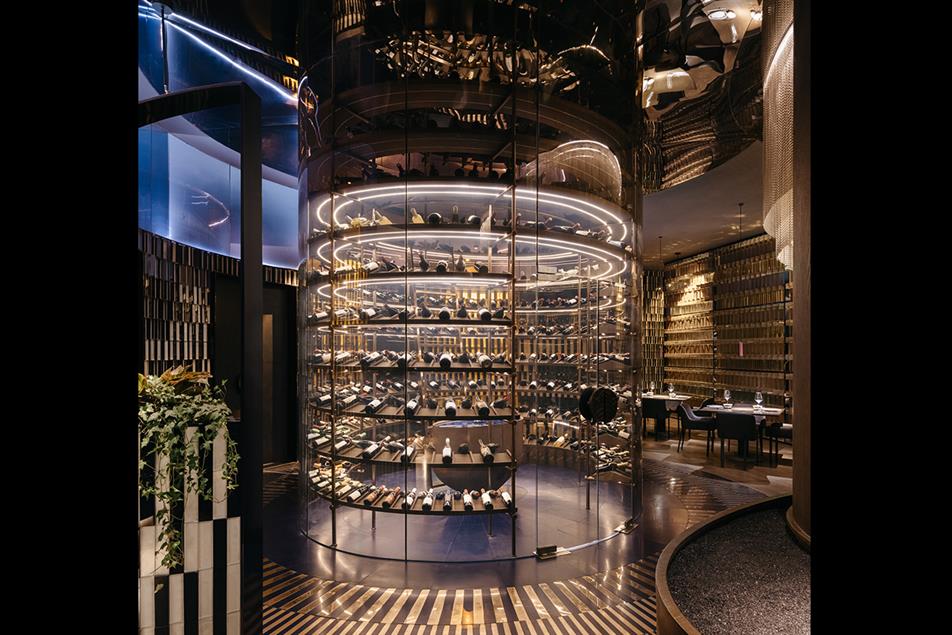
Project: Tidu Reserve, Shanghai Taikoo Li
Award: Bronze, Hospitality Interiors, Restaurants & Cafe's, Small Practice (Under 20 Employees), 2024
Location: Shanghai, China
Design Practice: RooMoo Design Studio
Client: Shanghai Tidu Catering Co., Ltd.
The design concept for "TIDU RESERVE", a well-known Beijing restaurant, is inspired by Beijing Roast Duck cuisine, which is unique for its layers. The same layering idea can be found in the Tidu graphic logo, using a Chinese official uniform's "Tide and Cliff" pattern and blue and gold as the primary colours. RooMoo uses the dynamic visuals of "Tide and Cliff" to simulate the overall interior, with each area resembling seaside rocks.
The judges said: "The concept of superimposing layers to create visual illusions is showcased through several distinctive elements in this restaurant that come together in a harmonious interplay of colours, textures, and materials."
The restaurant is divided into three areas: bar, dining, and an outdoor central garden. While each area appears independent, they mutually support diverse needs. Simulating the seawater flowing through coastal rocks, inspired by the official uniform pattern, RooMoo’s design employs a colour scheme of blue and gold with accents of red.
The judges singled out the "thoughtfully designed floor plan" and "a standout custom island tasting table in the wine room".
The semi-spherical glass reinforced gypsum ceiling, adorned with blue and beige paint and golden metal chains, simulates the dynamic imagery of seawater washing over gold ore. Four different assembly methods of blue and golden glass bricks on the walls provide varied visual perspectives for guests.
Of the golden metal chain ceiling, the judges said: "The ceiling design is impressive, complementing the floor plan's dynamic and inviting flow."
Design highlights
With its layered plant arrangement, the outdoor central garden area guides guests through a relaxing and secluded dining experience amidst lush greenery. The outdoor bar counter features coffee-coloured stainless-steel arcs with LED lights, creating a visually layered effect at night. The ceiling, showcasing a logo on glass panels through stacking, offers a dynamic view from different angles. The bar shelf, composed of overlapping blue semi-circular stainless steel panels, adds visual variety.
The judges said: "The interior spaces feature a sinuous, engaging movement that enhances the overall experience. The lighting is both effective and harmonious, perfectly complementing the textural architectural finishes and creating a cohesive ambience."
Photo credit: Wen Studio
- COMPANY FOUNDER: Ray Zhang
- COMPANY FOUNDER: Tao Zhan
- COMPANY FOUNDER: Marine Bois
DESIGN TEAM: Zheng Wang